
")
")
")
")

")


")

")


")
")
")
")
")

")


")

")


")

- This topic has 0 replies, 1 voice, and was last updated 11 years, 3 months ago by
 jim.
jim.
-
AuthorPosts
-

jimKeymasterLexmark Launches New Logo and New Identity. ( It's All About Green?)

Established in 1991 as a divested company of IBM, Lexmark is mostly known for its consumer- and business-level laser printers and supplies — we are the proud owners of a Lexmark C455dn — or what they call “imaging and output solutions”, sold in over 170 countries. Since 2010, however, Lexmark has acquired and integrated a number of software companies that have nothing to do with printing: intelligent capture, enterprise content management, healthcare content management, financial process automation and enterprise search. Now, Lexmark describes itself as a company that “creates enterprise software, hardware and services that remove the inefficiencies of information silos and disconnected processes, connecting people to the information they need at the moment they need it.” Yesterday, along with a new tagline, “Open the Possibilities”, Lexmark introduced a new identity. No design credit given. Designed by Moving Brands.
The previous logo wasn’t great but it was recognizable, particularly against the sans serif or simplified logos of its competitors, Epson and HP, and even Canon. Its small caps wordmark was definitely old school and not in the best way. The only remnant of the old logo in the new is the diamond shape. Sort of. And that’s a good thing. The new icon is meant to represent a lens aperture, creating a diamond shape in its opening. The first argument against it might be that, well, it’s not a photography-related company so why use an aperture? Well, Apple is not an agricultural company but it still employs a piece of produce as its logo. The idea here, that I do think is well considered and pays off on the new tagline, is that an aperture allows you to see things differently, it can be customized, and it’s precise… all this to say that I really like the new icon. It’s literal in its depiction of an aperture yet relatively abstract (but not far-fetched) as it relates to Lexmark.
Then there is the wordmark. My first reaction was negative. What happened to that “x”?! But the more I have looked at it the more I like it. The only reason it stands out is because we are so used to seeing “x”s have flat tops and bottoms not sides yet, in this wordmark, the “x” is perfectly constructed and consistent with the rest of the letters, fitting in beautifully and solving the always dreaded kerning issues that the side gaps generate. The “k” follows suit and supports the “x”, creating a consistent diagonal texture throughout the wordmark. Yes, it’s definitely strange and jarring at first glance but only because it properly challenges typographic conventions in an interesting way. Even the rest of the letters have a funky structure, with stems that taper in as in the “m”, “a”, and “r”. Kinda odd but kinda cool too.
I have no idea who designed this, so I’m not blowing smoke up anyone’s behind.
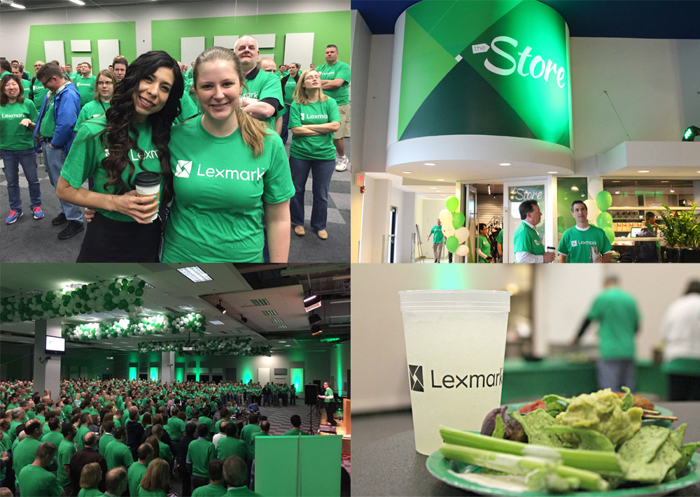
There is nothing to see in application, other than the t-shirts and lanyards which don’t reveal much, except perhaps that the logo works best in full color and not so well in its single-color application. The microsite does hint at some cool applications with x-like backgrounds and heavy diagonals. Overall, I think this might be one of the better corporate-leaning identity redesigns in some time. It’s safe enough to appeal to enterprise software buyers but it also has enough distinction to stand on its own in retail environments. More commendable though is that both design firm and client chose something different, especially nowadays when it seems that every visual angle for corporate wordmarks has already been done before.

-
AuthorApril 14, 2015 at 10:20 AM
- You must be logged in to reply to this topic.